Screen UI Component System
Problem:
The Square Marketing UI Library heavily relied on Apple UI to display the time, date and battery charging indication. The Marketing UI Library was extremely extensive showcasing many types of screens, demonstrating different usage of the Square’s POS and other offerings. Every iOS update would mean that each screen would need to have the time and date bar updated. Every rebrand also meant that we had to update the Primary Blue in every screen. This became very error-prone with different Production Designers copy/pasting or using an eyedropper for colour or translating every update.
Solution:
When building out these screens, I saw an opportunity to standardize frequently used common elements on Screens. I created a Figma Component System for Apple UI to display time, date and battery, along with the types of peripheral connected to the Square device with translations for all locales. I also created a system for the Menu Bar of the Favourites Checkout Screen, since it was often used. After publishing this Component System, in less than two months, there were more than 9,400 inserts of the components. Fast forward to a few more months, Square introduced a new font and it was immensely efficient for the font migration. When Square expanded into another country, this system was instrumental for better consistency and scalability on all Screen UI assets.
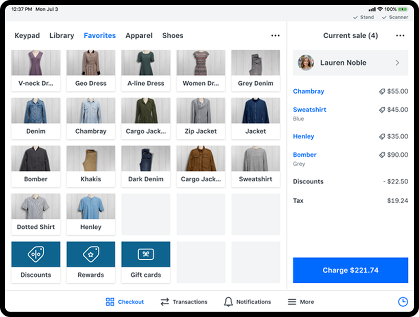
For efficienct production, I created a Figma Component for Apple UI at the top of the POS screen and Component for Checkout Menu Bar at the bottom of the screen. After I made this system, the entire Production Design discipline used these components in every screen build, eliminating any inconsistencies.
